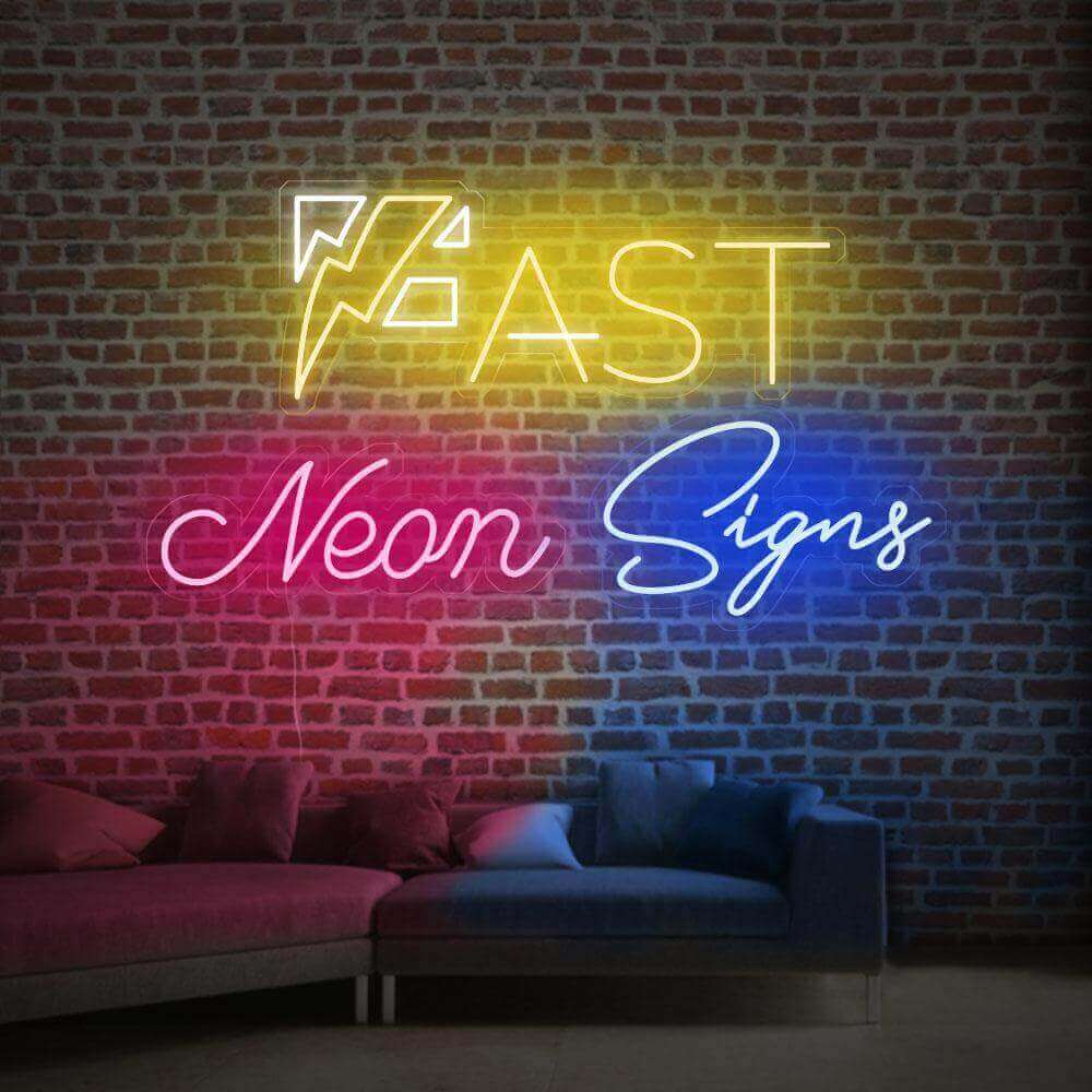

Choosing the right sign size is one of the most common questions people have—and one of the easiest to get wrong.
Too small, and it disappears into the background.
Too large, and it feels overwhelming or out of place.
The right size isn’t just about measurements. It’s about how the sign fits your space, how far away it’s viewed from, and what role it plays in the environment.
Why sign size matters more than you think
A sign isn’t just something you place on a wall—it’s something people need to see, read, and feel.
The size affects:
-
Visibility from a distance
-
Balance within the space
-
Overall visual impact
In many cases, changing the size has a bigger effect than changing the design.
Start with viewing distance
A simple way to think about sign size is:
👉 The farther away people are, the larger the sign needs to be.
Close-range viewing (1–3 meters / 3–10 ft)
Used for:
-
Bedrooms
-
Living rooms
-
Interior walls
👉 Recommended width:
30–60 cm (12–24 inches)
This works well for LED neon signs used as decor or personal elements.
Mid-range viewing (3–6 meters / 10–20 ft)
Used for:
-
Indoor commercial spaces
-
Café interiors
-
Reception areas
👉 Recommended width:
60–100 cm (24–40 inches)
This size balances visibility and proportion without overwhelming the space.
Long-distance viewing (6+ meters / 20+ ft)
Used for:
-
Storefront signage
-
Outdoor walls
👉 Recommended width:
100–200 cm (40–80 inches)
For these situations, lightbox signs or larger illuminated signs are often used to ensure readability.
Sign size by use case
Instead of thinking only in measurements, it often helps to think in scenarios.
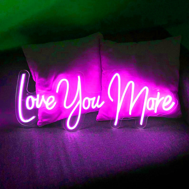
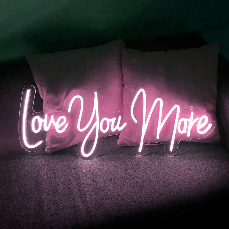
Home decor signs
For most homes, smaller sizes work better.
-
30–50 cm → subtle accents
-
50–80 cm → focal points
LED neon signs are commonly used in this range, especially for names, phrases, or decorative lighting.
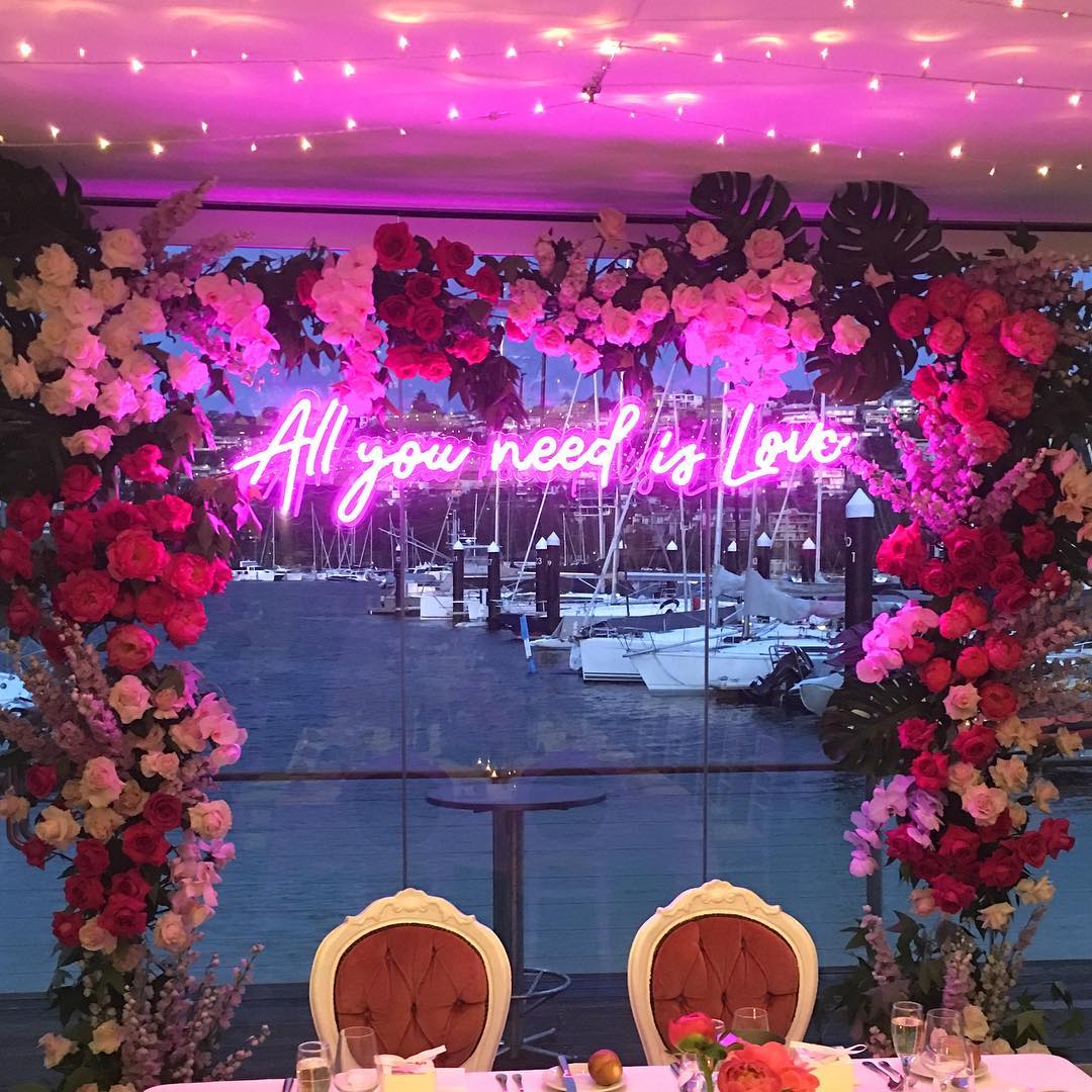
Coffee shops and restaurants
Interior signs usually fall in the mid-range.
-
60–120 cm → logo or wall signs
-
80–150 cm → statement pieces
The goal here is to make the sign visible without overpowering the space.
 Example of a 42-inch interest acrylic backlit sign from FastNeonSigns Instagram
Storefront signs
For outdoor use, size becomes much more important.
-
100–200 cm → standard storefront
-
Larger if visibility from across the street is needed
Outdoor signs in this category need to be both readable and proportionate to the building.
 Example of a 60-inch metal backlit outdoor sign from FastNeonSigns
A simple rule that works in most cases
If you’re unsure, this rule helps:
👉 Your sign should take up about 50%–70% of the available wall width
For example:
-
Wall width: 120 cm
-
Sign width: 60–80 cm
This usually creates a balanced and intentional look.
Common mistakes to avoid
Choosing a size based only on aesthetics
A sign might look good in isolation—but if it’s too small to be noticed, it won’t work.
Ignoring wall proportion
Even a well-designed sign can feel “off” if it doesn’t match the scale of the wall.
Going too big for small spaces
Oversized signs can make a room feel crowded, especially in home settings.
When in doubt, go slightly larger
One pattern shows up again and again:
👉 Most people regret choosing a sign that’s too small—not too large.
If you’re between two sizes, the slightly larger option is usually the safer choice.
FAQ
Q: What is the most common sign size?
A: For indoor use, 60–100 cm (24–40 inches) is one of the most common ranges.
Q: How do I measure for a wall sign?
A: Measure the width of your wall or space, then choose a sign that fills about 50%–70% of that width.
Q: Are larger signs always better?
A: Not always. The best size depends on viewing distance and space proportions.
Finding the right size
There’s no universal “perfect size,” but there is a size that works best for your space.
Start with your wall width, consider how far the sign will be viewed from, and aim for balance rather than precision. In most cases, choosing slightly larger will give you a better result than going too small.