When we design a space—whether it’s a café, a retail store, or even a small studio—signage isn’t just something we “add at the end.”
It’s part of how the space communicates.
Different types of signs don’t just look different—they create different moods, draw attention in different ways, and influence how people experience the space.
So instead of asking “which sign is better,” the real question is:
👉 What role should the sign play in your space?
Start with intention, not material
Before choosing between neon, lightbox, or acrylic, designers usually think about one thing first:
👉 Do you want the sign to stand out, blend in, or define the atmosphere?
Each type does one of these particularly well.
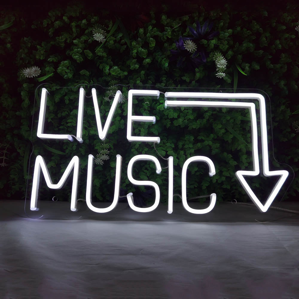
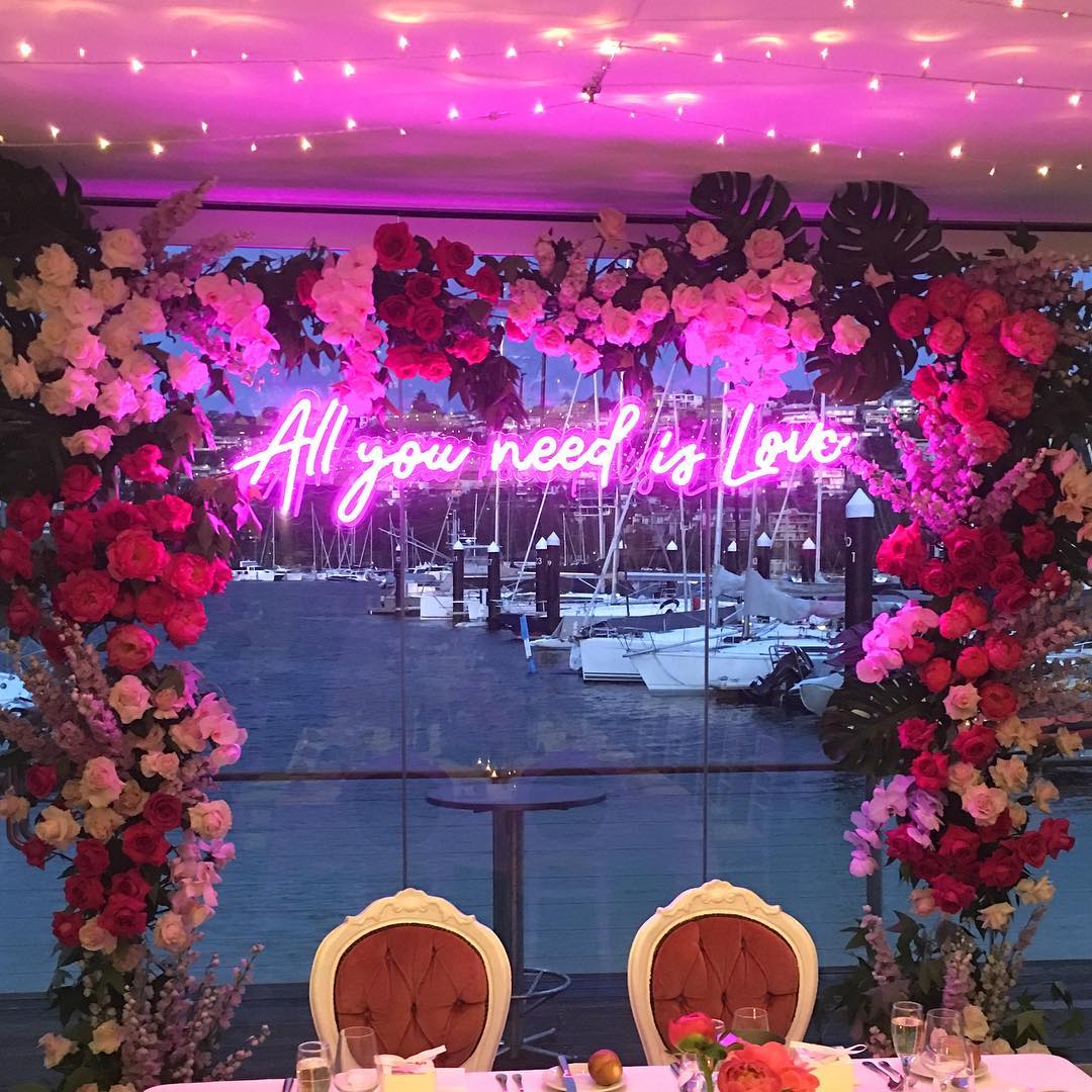
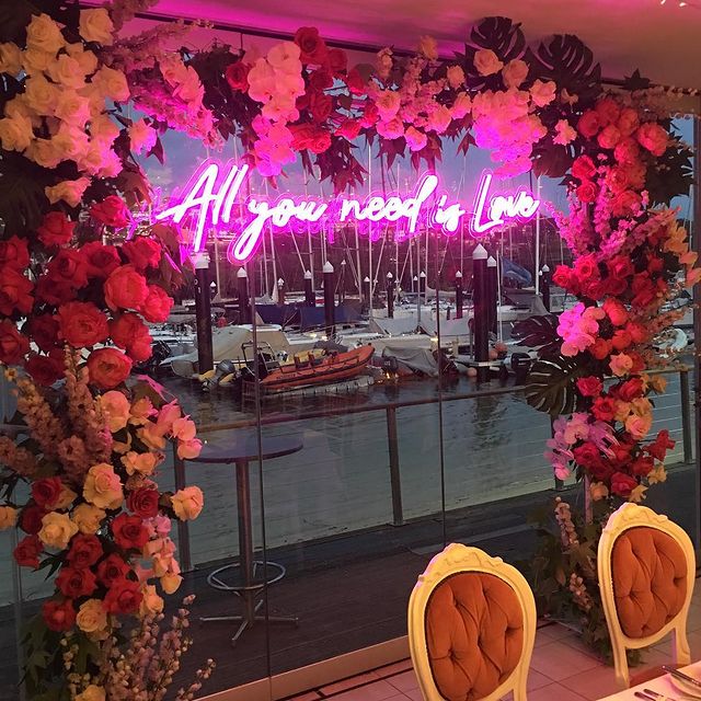
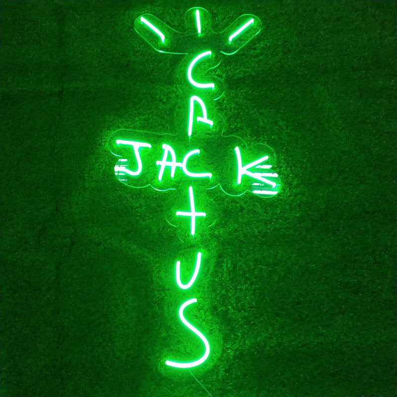
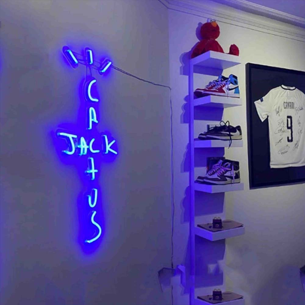
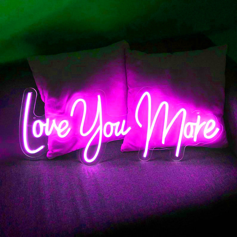
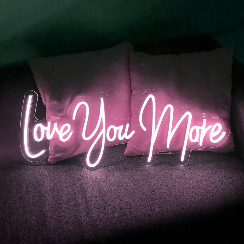
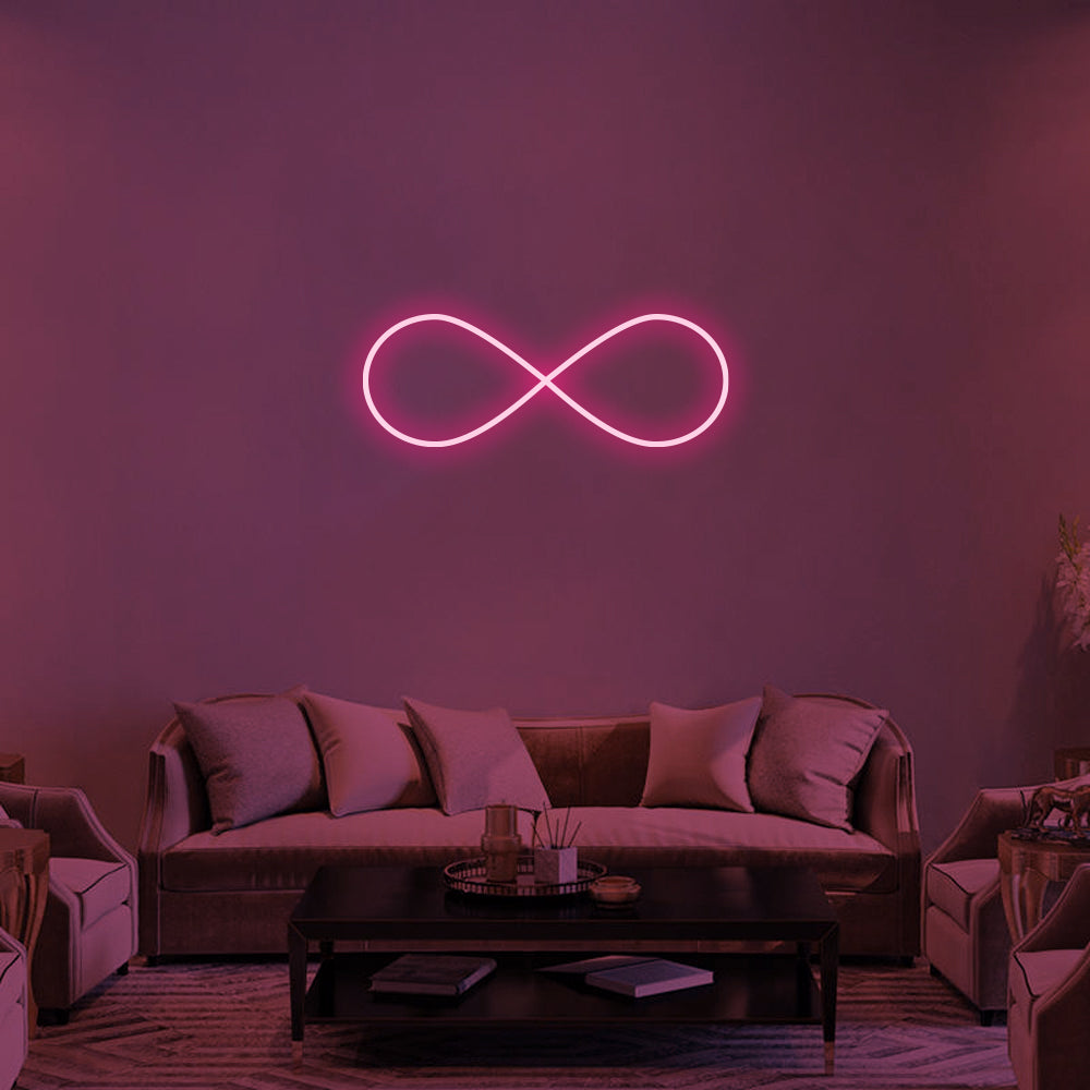
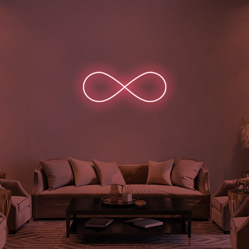
LED neon signs: for atmosphere and personality
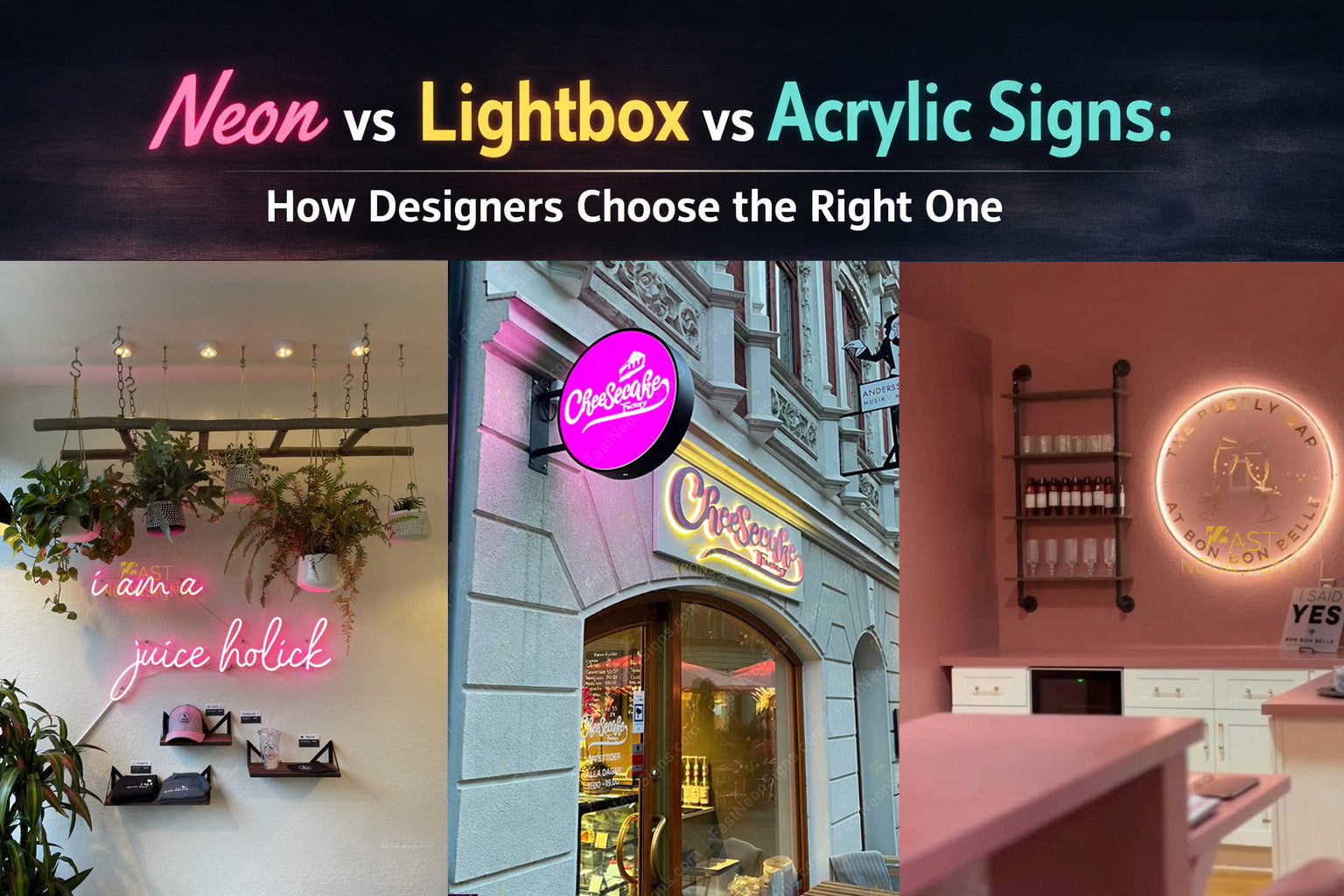
If the goal is to create a feeling—something people remember or photograph—neon is often the first choice.
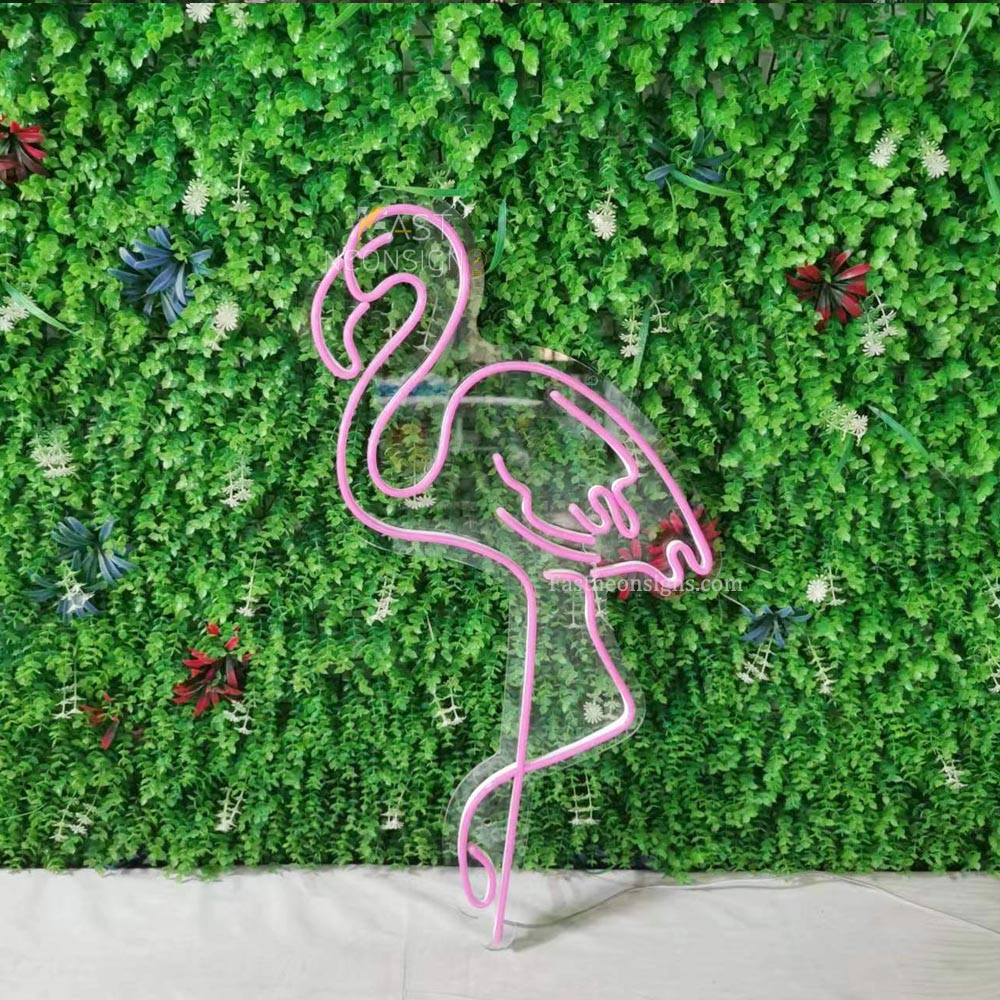
LED neon signs are less about clarity and more about emotion. They add warmth, softness, and a sense of identity to a space.
You’ll often see them used:
- Behind a café counter
- On feature walls
- In lounges or creative studios
Design-wise, they work best when:
- The lighting is slightly dim
- The message is short
- The goal is to create mood rather than give information
👉 Designers often treat neon as part lighting, part branding.
Lightbox signs: for visibility and clarity
When visibility matters—especially from a distance—lightbox signs are usually the go-to.
Letter & lightbox signs provide even, consistent illumination, making them easy to read both day and night.
They’re commonly used for:
- Storefront signage
- Menu displays
- Wayfinding or directional signs
From a design perspective:
- They create a clean, structured look
- They work well in busy environments
- They help a brand feel more established and easy to recognize
👉 Think of lightboxes as functional branding tools.
Acrylic signs: for a clean, modern presence
If you want something subtle, minimal, and integrated into the space, acrylic signs are often the best fit.
Acrylic signs don’t rely on strong lighting. Instead, they reflect ambient light and blend into their surroundings.
They’re often used:
- At reception desks
- On interior logo walls
- In boutique or gallery-style spaces
Design-wise, they:
- Feel refined and understated
- Work well in bright, neutral environments
- Let the space “breathe” without too much visual noise
👉 Designers use acrylic when they want the brand to feel quiet but intentional.

How designers choose between them
In practice, it’s rarely about picking one “best” option.
It’s about matching the sign to the role it plays.
If the goal is atmosphere → choose neon
- Creates emotion
- Encourages photos and sharing
- Works best indoors
If the goal is visibility → choose lightbox
- Clear from a distance
- Works day and night
- Ideal for storefronts
If the goal is subtle branding → choose acrylic
- Minimal and clean
- Best for interior use
- Supports a refined aesthetic
Combining sign types (what actually happens in real projects)
In many commercial spaces, designers don’t choose just one.
They layer them.
For example:
- A lightbox sign outside to attract attention
- An acrylic logo inside for a clean brand presence
- A neon sign on a feature wall for atmosphere
This combination creates a more complete experience—from first impression to in-store feeling.
A simple way to decide
If you're unsure where to start, ask yourself:
- Do people need to see it from far away?
- Or is it something they discover once inside?
- Should it feel bold, subtle, or expressive?
Answering these questions usually leads you to the right type.
FAQ
Q: Which sign type lasts longer?
A: All three are durable, but lightbox and acrylic signs are often chosen for long-term installations, especially outdoors.
Q: Can neon signs be used outside?
A: Yes, but they are most commonly used indoors for atmosphere and design impact.
Q: Is acrylic signage visible enough?
A: For close-range and interior use, yes. It’s designed for subtle presence rather than high visibility.
Choosing the right sign for your space
There’s no single “best” sign—only the one that fits your space, your brand, and how you want people to experience it.
When the material, lighting, and placement all work together, the sign stops feeling like an add-on—and becomes part of the design itself.