
When choosing illuminated signage, one of the most common questions is:
👉 Should I go with front-lit or backlit signs?
At first glance, the difference seems simple.
But in real design projects, this choice affects not just visibility—but the entire feel of a space.
Understanding the difference (at a glance)
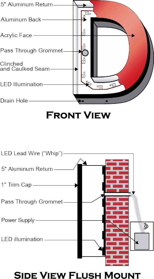
- Front-lit signs → light shines outward through the face
- Backlit signs (halo-lit) → light glows behind the letters onto the wall
👉 One is direct and visible
👉 The other is soft and atmospheric
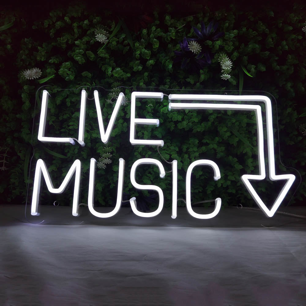
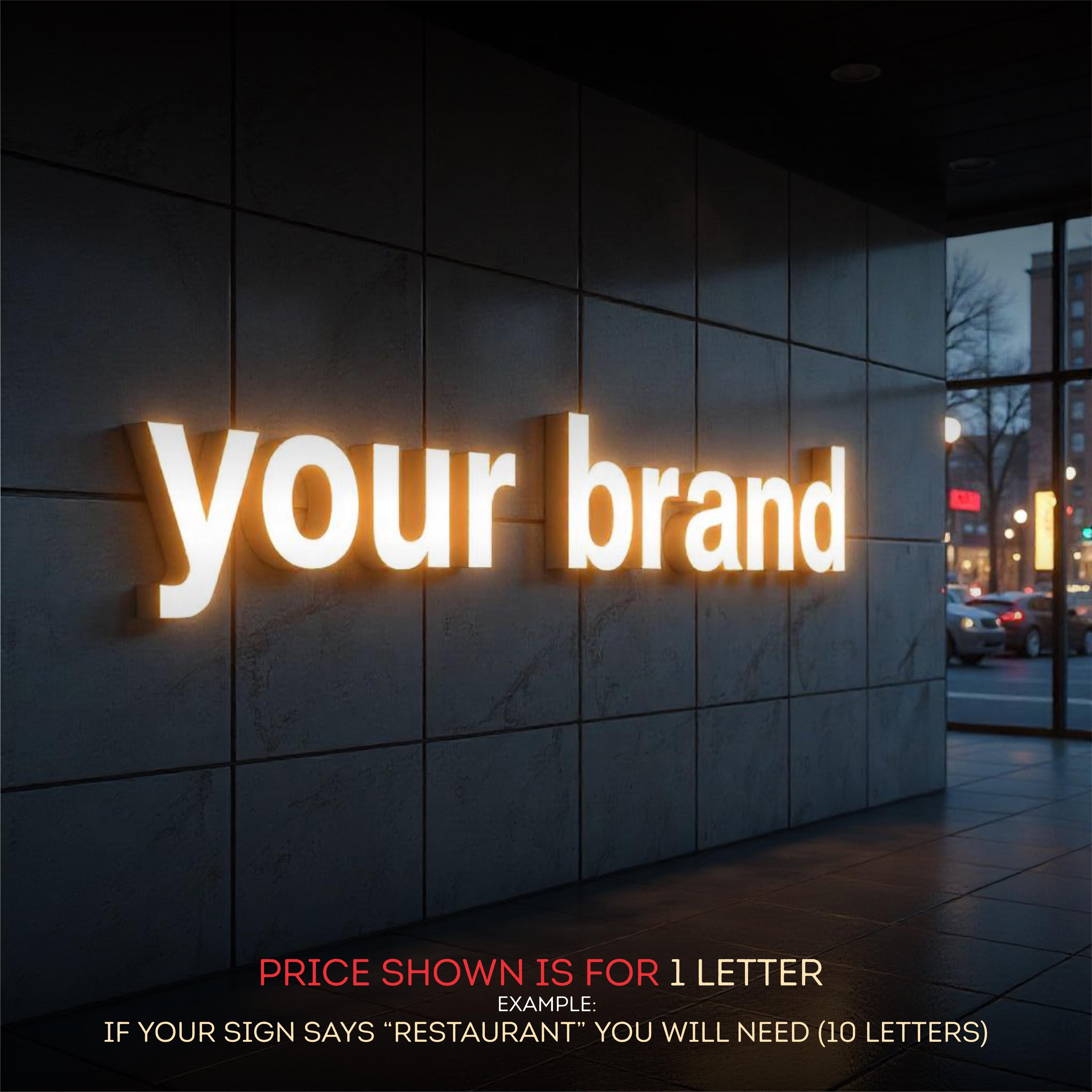
Front-lit signs: built for visibility
Front-lit signs are designed to be seen clearly—especially from a distance.
They’re one of the most common choices for storefronts and outdoor signage.
Best for:
- Busy streets
- Outdoor storefronts
- Businesses that rely on clear recognition
What they feel like:
- Bright
- Direct
- Easy to read


👉 Designers often choose front-lit signs when:
- The goal is to attract attention quickly
- The sign needs to compete with surrounding visuals
👉 You’ll commonly see this style in
Lightbox signs and illuminated channel letters.
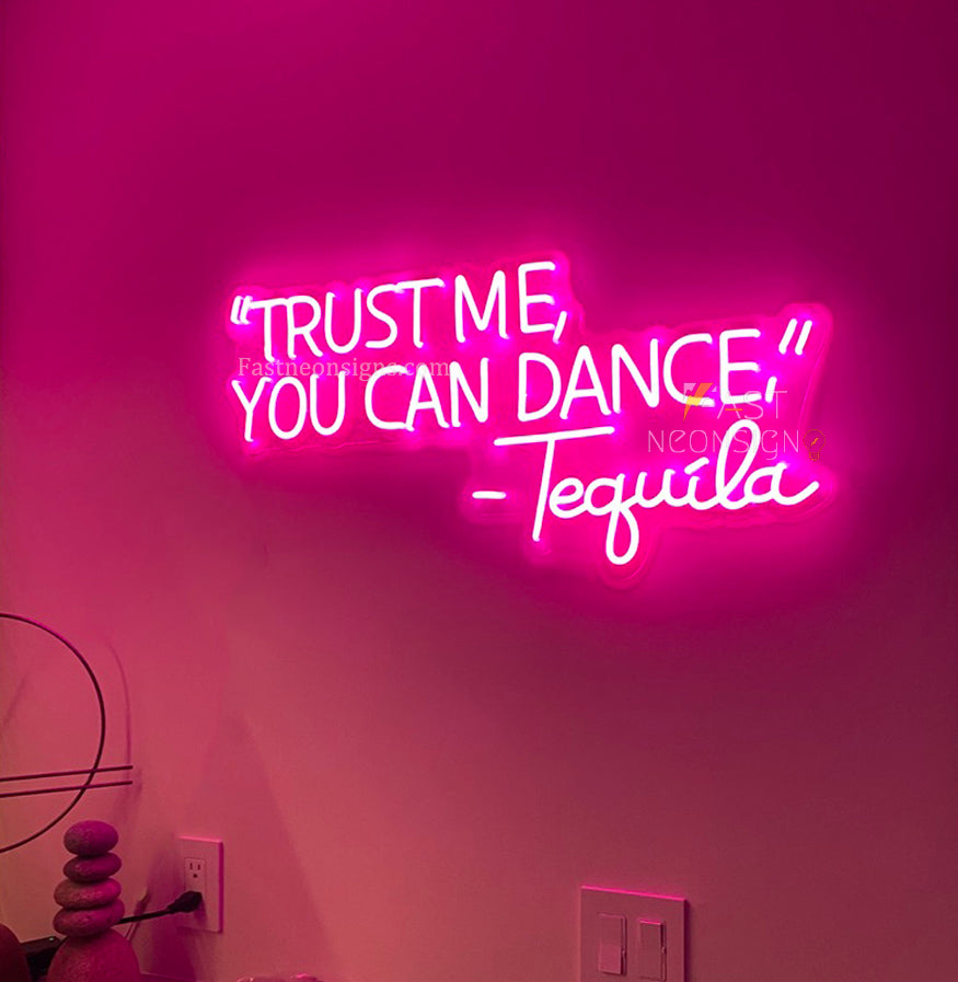
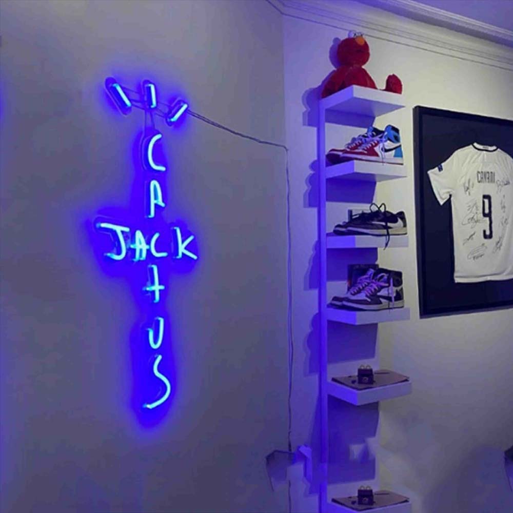
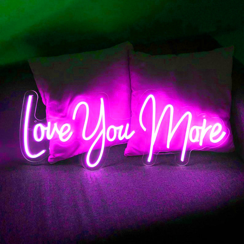
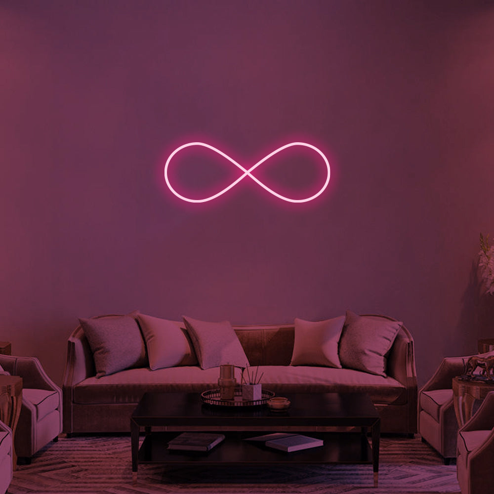
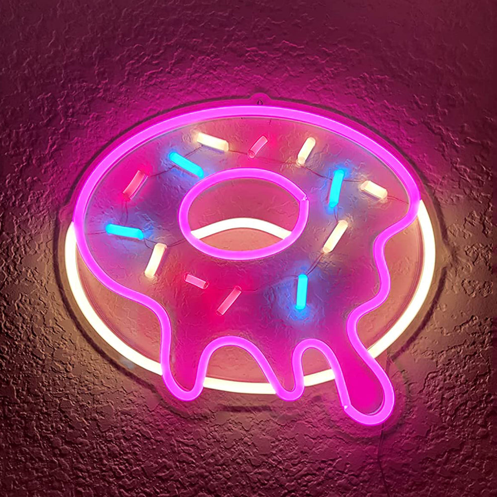
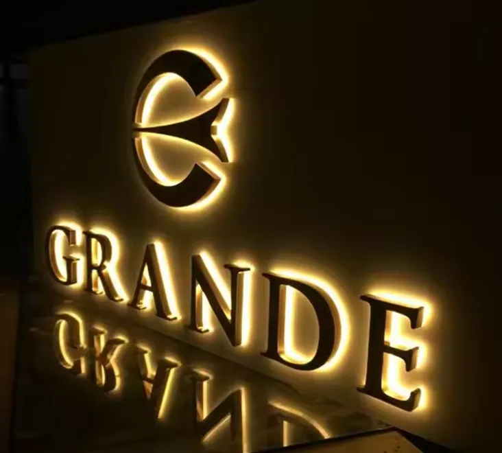
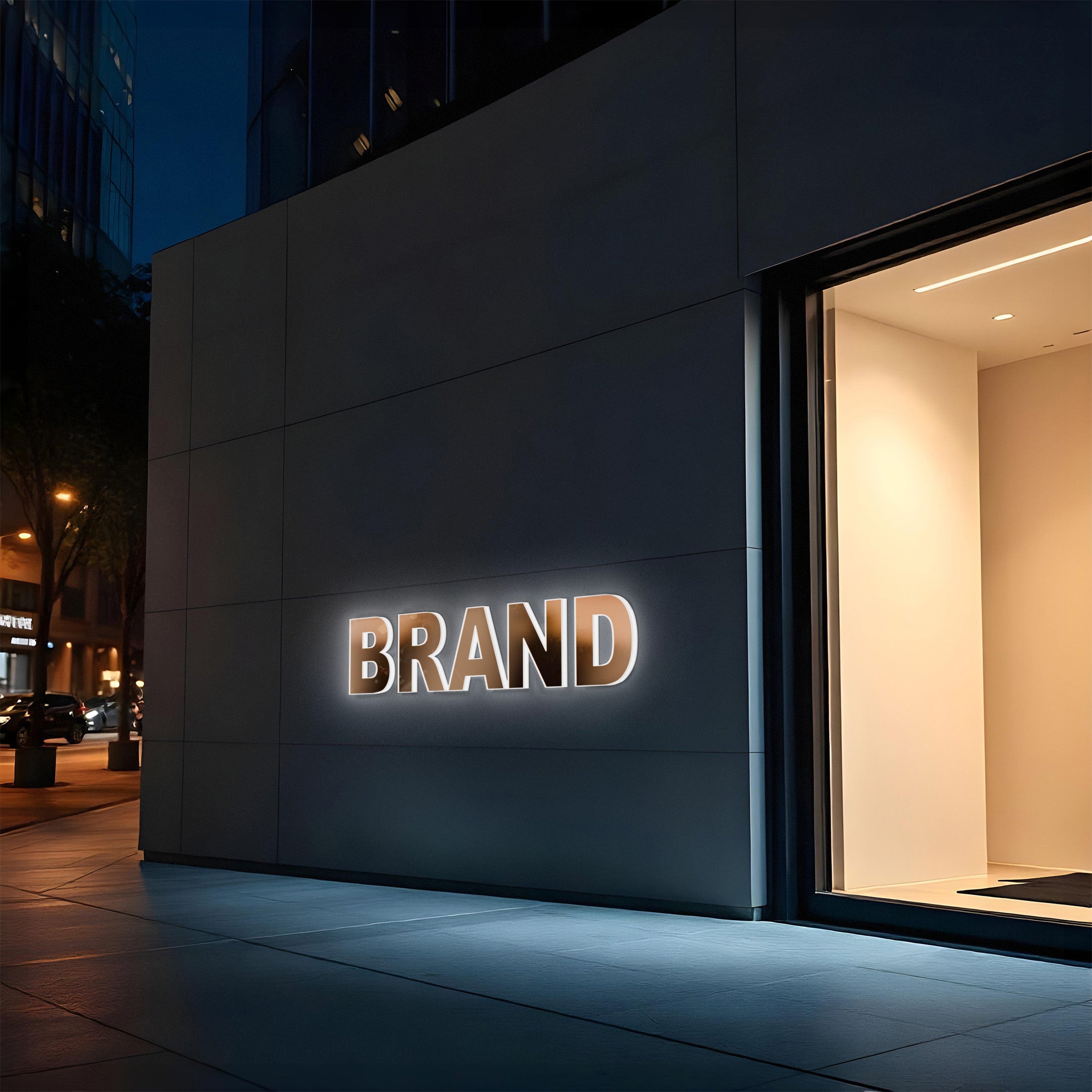
Backlit signs: designed for atmosphere
Backlit (halo-lit) signs create a glow around each letter rather than shining directly forward.
They’re less about visibility—and more about presence.
Best for:
- Premium storefronts
- Boutique spaces
- Interior branding
What they feel like:
- Soft
- Subtle
- Elevated

👉 Designers choose backlit signs when:
- The space already has controlled lighting
- The goal is to create a refined, less aggressive visual
👉 Often used with
metal or acrylic signage for a clean finish.
The real difference: visibility vs feeling
| Feature | Front-lit | Backlit |
|---|---|---|
| Visibility | High | Medium |
| Readability | Very clear | Softer |
| Mood | Bold | Subtle |
| Best use | Outdoor / storefront | Interior / premium spaces |
👉 This is not about which is “better”
👉 It’s about what your space needs
How designers actually decide
In real projects, the decision usually comes down to one question:
Do you need to be seen—or remembered?
- If people need to spot your business from across the street → Front-lit
- If people are already inside or close → Backlit
Using both together (most effective approach)
In many well-designed spaces, both are used.
Example setup:
- Outside → Front-lit sign for visibility
- Inside → Backlit logo for atmosphere
👉 This creates a layered experience:
👉 Attention → Entry → Experience
A simple way to choose
If you're unsure:
- Bright, busy environment → go front-lit
- Minimal, curated space → go backlit
👉 If you're between the two:
👉 Slightly more visibility is usually safer than too subtle.
FAQ
Q: Is backlit signage visible enough outdoors?
A: It depends on lighting conditions, but it’s generally less visible than front-lit signs in bright environments.
Q: Are front-lit signs too harsh for interiors?
A: They can be, especially in small or low-light spaces.
Q: Which one feels more premium?
A: Backlit signage is often perceived as more refined.
Choosing the right balance
Both front-lit and backlit signs serve different roles.
When chosen correctly, they don’t just display your brand—they shape how people see and experience your space.